

I got to know them
I had a great initial conversation with the CoroNerve team. I learned that the site is primarily for the medical community. However, now CoroNerve wanted the public to access and understand their research.
CoroNerve admitted it was time for re-design. So I directed the team to conduct a Heuristic Analysis of the site. We took stock of the current Information Architecture to see what direction we needed to take.
It gave us some insight but we needed more.


We got to know their users
We wanted to become familiar with how the users, both doctors, and the public, wanted to receive information about COVID-19. I conducted in depth interviews with both audiences to get an understanding of their point of view. I also conducted Contextual Inquiries to observe and understand how both audiences interacted with the current site.
After we developed an affinity map of our findings, we discovered a multiple themes which we summed up in "I" statements. One theme stood out: a desire for information to be clear and digestible.
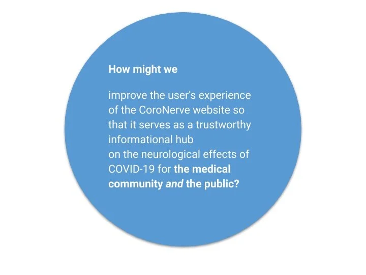
And got to work
I offered we should develop two problem statements to keep our designs and content focused, one for the public user and one for the users in the medical community. We eventually combined them into one “how might we” statement.
DoctorS Problem Statement
The medical community needs an up-to-date reference on the effects of COVID-19 on the function of the nervous system so that they can diagnose accurately, relay insight to patients, report cases and keep up with relevant research.
Public Problem Statement
People outside of the medical community need to be able to access and share credible information on the effects of COVID-19 on the nervous system's function so that they can understand symptoms and keep up with developing research.
I coughed up some sketches

Once we defined our problem, we jumped right into a design studio and sketched.
With the research in mind the team dove into over multiple rounds of sketching. Every round my individual sketches would evolve as I incorporated my team’s ideas. I was eager to see if the ideas we landed on would work.
We created Medium Fidelity Wireframes and two different flows for our users in the medical community and the public.
Medium Fidelity Desktop Wireframes
for the prototype

We set testing goals

What happened?
After conducting the tests, we made some discoveries:
The Public users were confused by some of the writing
A doctor was confused by one of our groups
Both Doctors and Public Users used the Header Navigation before scrolling.
All users completed their flows in the 5 minute period we had hoped.
We appeared to be on the right path though we needed to adjust the language and writing. We continued building out the remaining screens.

High Fidelity Desktop
for our second prototype
After adjusting the language and building out the rest of the pages fo the Hi-Fidelity Prototype we implemented a Design System and new brand identity that we were creating alongside the Medium fidelity wireframes. Using the brand system we wanted to offer a sense of credibility and trust alongside a feeling of accessibility and comfort.

Hi Fidelity Mobile
home page & hamburger Menu

